
R+V App: Sitting can be deadly
Overview
"Sitting can be deadly" is a campaign by R+V Versicherung. The app makes users aware of the topic. It reminds users to move. Humorous videos re-enact situations that can end fatally. I designed the user flow and the app screens. These include the introduction, the dashboard, and the reminders.
- Type
- Mobile app and campaign
- Role
- UI/UX design and concept, user flow and app screens
- Tools
- Figma
- Skills
- Competitor analysis, Interviews, UX concept, User flow, UI design, Prototyping, Usability tests
Project snapshot
Results
68 %
of new users set a reminder at the first start
47 %
of users watch the whole video after a reminder
4.5 out of 5
participant satisfaction in the last round
Goal
The app makes users aware of the topic of sitting. It reminds users regularly to move. Users can complete the setup in a few steps.
Challenge
The topic is serious. The app still has to feel light and friendly. Users must be able to set up reminders quickly. The app must not disturb users, or they delete it. It also shows little data.
Outcome
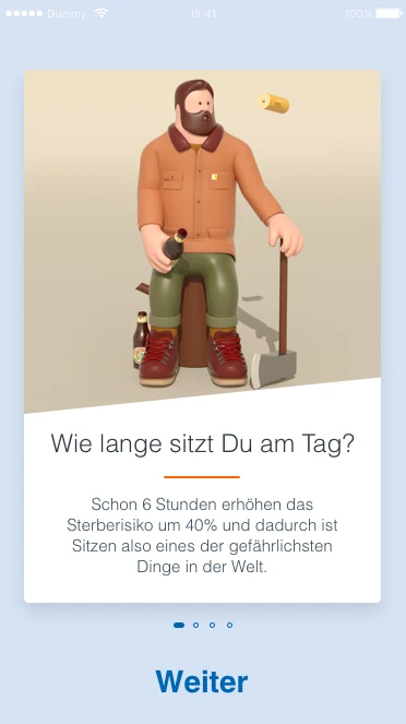
An introduction with four cards explains the app. The dashboard shows the start button inside pulsing circles. The reminders appear as a list with switches. After a reminder, a video starts in full screen. The statistics show the steps.

UX research and discovery
- 12
Interviews
with office employees
- 3
Rounds of usability tests
with five participants each on the prototype
- 5
Competitors analyzed
Apps for breaks and movement
- 2
Target groups
Office and home office
User goal
Users want to be reminded of breaks without effort. They want to decide when and how often the app notifies them.
Business goal
More people know the campaign. The app shows R+V as an insurer that supports its customers. Users keep the app and use it regularly.
User insights
76%
Sitting without noticing
They lose track of time during the working day and rarely get up.
83%
Wish for a simple reminder
They want to set days, time range, and interval in a few steps.
69%
Videos attract attention
Humor invites users to look more than a plain warning text does.
61%
Wish for few numbers
One single number is enough for them. They see more data in Apple Health when needed.
Color palette
- #0066b3R+V blue
- #014289Dark blue
- #ed6d33Orange
- #99ccffSky blue
- #d6e2f4Light blue
Iterative process
User flow: First use of the app
User flow: Dashboard and reminder
User flow: Statistics and initiative
Research
Persona Jonas, office employee
- Invented example persona.
- In the office, he often sits at the screen for hours.
- He forgets breaks.
- He wants a short reminder that does not disturb him.
Persona Petra, in the home office
- Invented example persona.
- She works from home. There, she has no walks to colleagues.
- She wants reminders only on working days.
- She likes to set the times herself.
Competitor analysis
- I compared five apps that remind users of breaks or movement.
- I looked at onboarding, settings, and scope.
- Many apps were overloaded.
- This led to the goal: few features, explained clearly.
Interviews
- I interviewed twelve office employees.
- I wanted to know when they get up and how they think of breaks.
- The personas and the wishes for the reminder came from this.
Humor instead of a warning text
- Why: A humorous video invites users to look. A plain warning text puts many people off.
- Instead: Warning images and long notes.
- Trade-off: Humor can play down a serious topic. Therefore the texts in the app stay factual.
Reminding instead of measuring
- Why: The app raises attention for the topic. It does not evaluate every step.
- Instead: Its own tracking with many numbers.
- Trade-off: The app shows little data. In return, it stays simple.
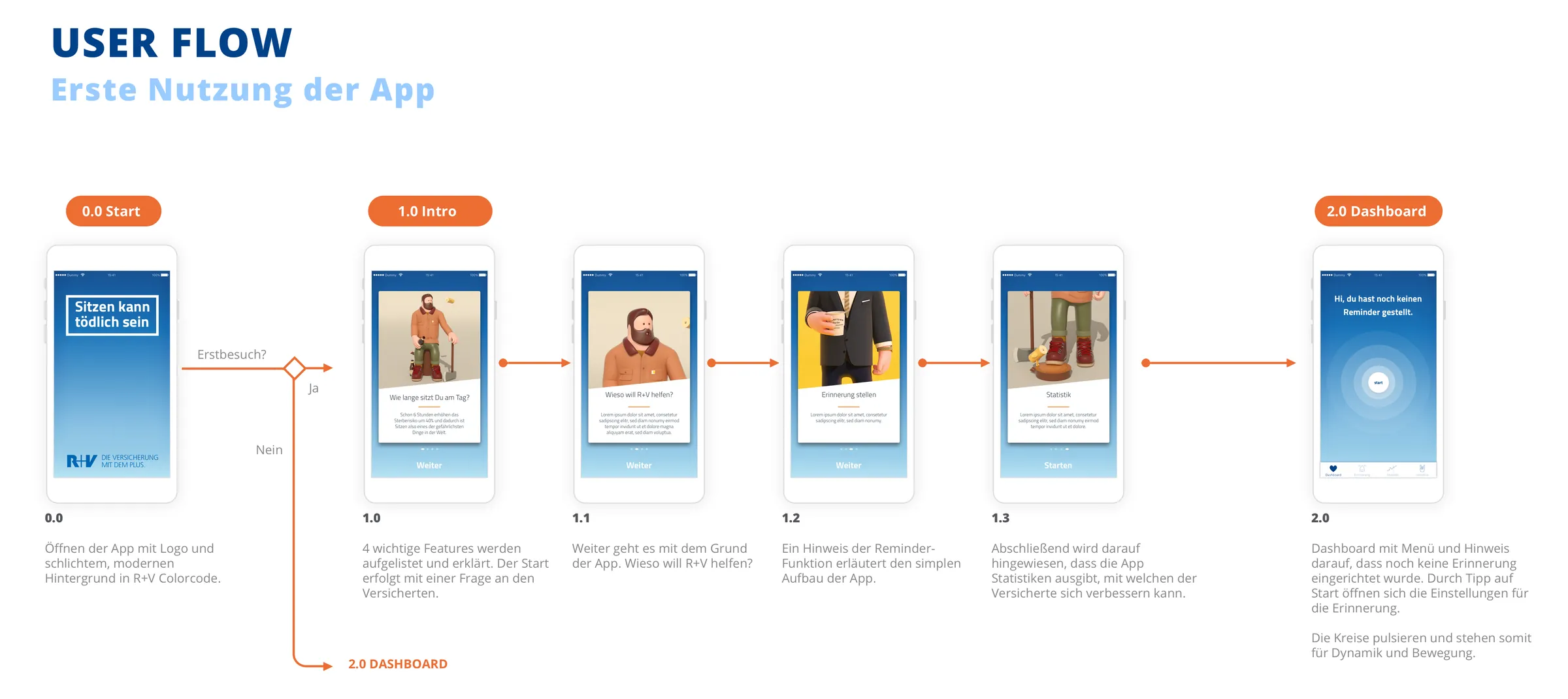
First use
Flow at the first start
- The start screen shows the logo on a calm background in the colors of R+V.
- At the first visit, the introduction follows. Otherwise, the dashboard opens directly.
- The introduction consists of four cards.
- The first card asks how long users sit per day.
- The other cards explain the reason for the app, the reminder, and the statistics.
- The last card holds the start button.
A question at the start instead of an explanation text
- Why: A question addresses users personally. They think about their own sitting time.
- Instead: A long introduction text.
- Trade-off: Users do not enter an answer. The question only prompts them to think.
Four cards instead of long instructions
- Why: Each card explains exactly one thing. Users swipe on quickly.
- Instead: Long instructions.
- Trade-off: Each card has little space. The text stays short.
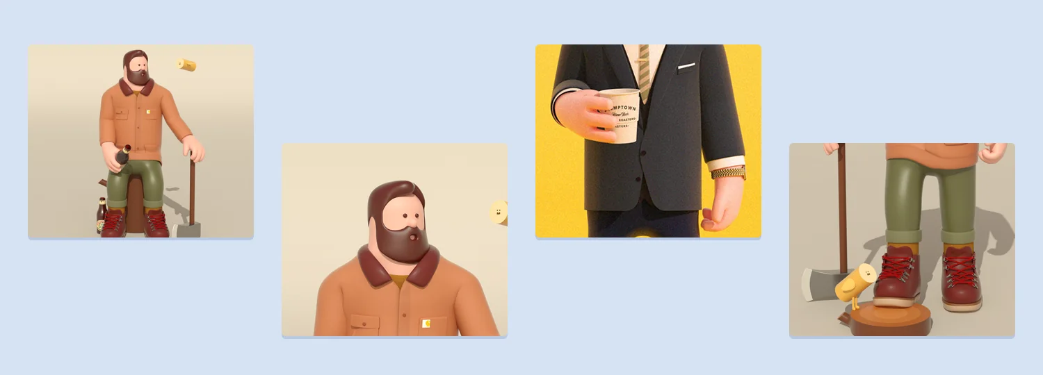
3D characters as the face of the campaign
- Why: Characters make a serious topic accessible. They give the campaign a face.
- Instead: Shock images or plain texts.
- Trade-off: The characters draw a lot of attention. The text of the card steps back as a result.
Dashboard and reminder
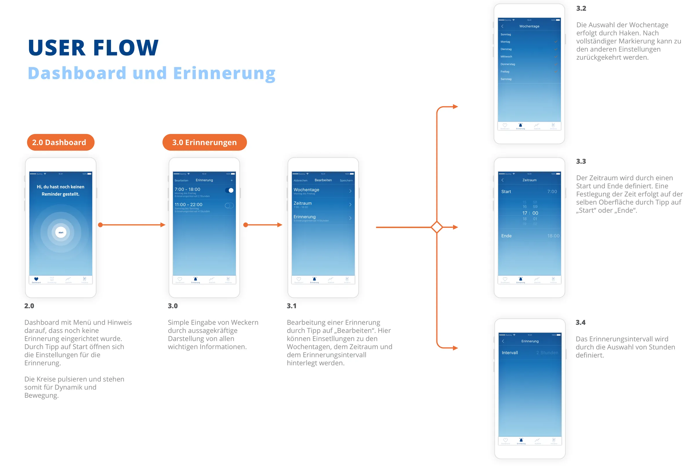
Dashboard
- A tab bar with four areas guides users through the app.
- Without a reminder, the dashboard shows a note and the start button.
- A tap on start opens the settings of the reminder.
- The circles around the button pulse.
Pulsing circles around the start button
- Why: The circles stand for dynamics and movement. They draw the eye to the button.
- Instead: A calm surface with text.
- Trade-off: The animation needs calm around it, so that it does not distract.
Setting up a reminder
- The list shows each reminder with time range, days of the week, and interval.
- A switch turns it on or off.
- A tap on edit opens the settings.
- There, users choose days of the week, start, and end.
- Users choose the interval in hours from one to four.
Reminders as a list with switches
- Why: All important details are visible at a glance. One switch is enough to turn a reminder on or off.
- Instead: A detail screen for each reminder.
- Trade-off: The list shows much text in a small area. Therefore the times are set large.
Days of the week by checkmark
- Why: Checkmarks are quick to set. Users see at once which days apply.
- Instead: Seven single switches in the settings list.
- Trade-off: The selection needs its own screen. From there, users go back to the other settings.
Time selection on the same surface
- Why: A tap on start or end opens the time selection directly below. Users stay in context.
- Instead: A separate screen for the time.
- Trade-off: The surface becomes longer. In return, the view does not jump.
Reminder and video
- The reminder appears as a notification on the lock screen.
- Users who swipe it away see a video in full screen and in portrait format.
- The video creates the moment that raises attention for the topic.
Full-screen video instead of text in the notification
- Why: The video needs the whole surface, so that the scene works. It draws more attention than a text.
- Instead: A longer notification text.
- Trade-off: Not everyone has time for a video at the moment. Therefore the videos are short.
Statistics and initiative
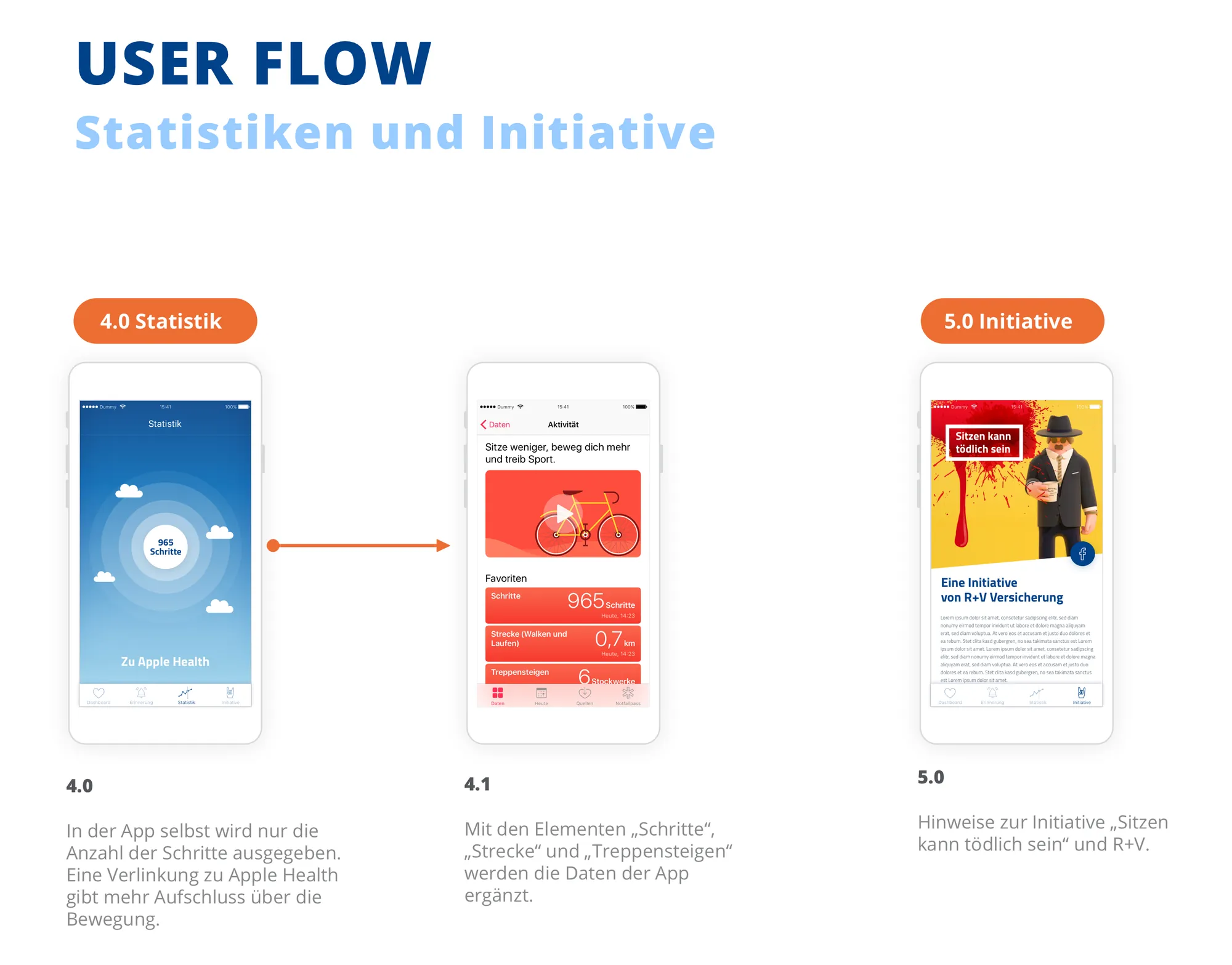
Statistics
- The app itself shows only the number of steps.
- A link leads to Apple Health. There, users find more data about movement.
- There, steps, distance, and flights climbed add to the data of the app.
Only steps in the app
- Why: One number is quick to read. The app stays a tool for reminding.
- Instead: Its own evaluations and charts.
- Trade-off: Users who want more data leave the app. In return, the app does not have to maintain its own evaluations.
Initiative
- An area Initiative explains the campaign Sitting can be deadly and R+V.
- It shows the campaign motif and a short text.
App screens
Intro 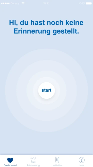
Dashboard 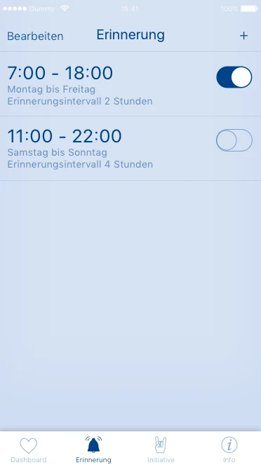
Reminder 
Video 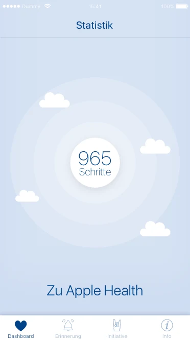
Statistics
Validation
I tested the prototype in three test rounds with five office employees each. I checked whether they set up reminders without help. After each round, I revised the introduction, the time selection, and the dashboard.
Reflection
A question at the start addresses users at once. Few steps in the setup keep the barrier low. Humor needs clear limits, so that the serious topic stays serious. In future, I would test the videos with users earlier.