Ladival website with skin type test
Overview
Ladival is a sun protection brand. I designed a website with a skin type test for Ladival. First, I drew a flowchart with 15 mobile screens. Then I designed the test with five questions and a result. I also designed the home page and the product page. The test helps users find a suitable product.
- Type
- Website
- Role
- UI/UX design and concept
- Tools
- Figma
Project snapshot
Goal
The website helps users find a suitable sun protection product. The skin type test is short and easy to understand. The result leads directly to a product.
Challenge
The website connects products, articles, the pharmacy finder and the test. I had to decide where the test starts and where the result leads. Users can answer the five questions quickly.
Outcome
A flowchart shows 15 mobile screens and their paths. The test asks one question per screen and shows the progress. The result names a skin type with three key facts and recommends a product. The home page and the product page lead to the test.

Color palette
- #ffd451Sun yellow
- #fcc92bDark yellow
- #005db4Brand blue
- #e66d7fPink
- #e5eef7Light blue

From flowchart to design
Flowchart of the mobile wireframes
Flowchart
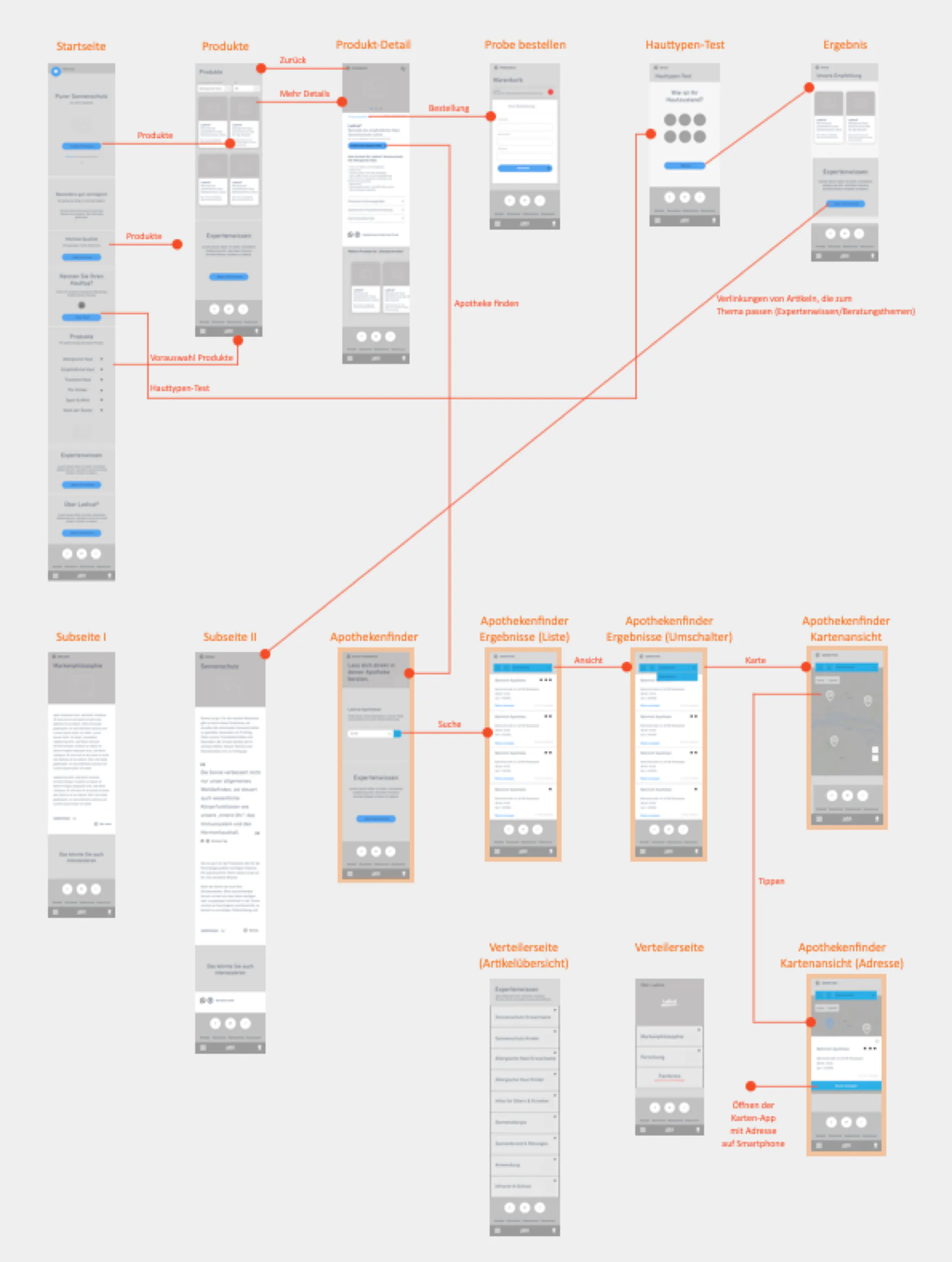
15 screens in three rows
- First, I collected and sorted the pages of the website.
- The flowchart shows 15 mobile screens in three rows.
- The first row shows home page, products, product detail, order a sample, skin type test and result.
- The second row shows subpage I, subpage II and four screens of the pharmacy finder.
- The third row shows two overview pages and the map view with address.
- Orange lines show how the screens connect.
Flowchart before the details
- Why: The flowchart shows how home page, products, test and pharmacy finder connect. I see this before any screen gets details.
- Instead of: Working out each screen on its own.
- Trade-off: The screens are small and drawn roughly. In return, all 15 screens fit on one sheet.
The test as its own path
- In the flowchart, the skin type test has its own path.
- On the home page, the button To the test leads to the skin type test.
- The button Next leads from the skin type test to the result.
- From the result, the button Get informed now leads to subpage II.
- This line stands for articles that fit the topic.
Smartphone first
- Why: Every bit of space counts on the small screen. So the wireframes show the mobile view first.
- Instead of: Drawing the desktop view first.
- Trade-off: The desktop layout follows later. In return, the content stays limited to the essentials.
Skin type test
Flow of the test
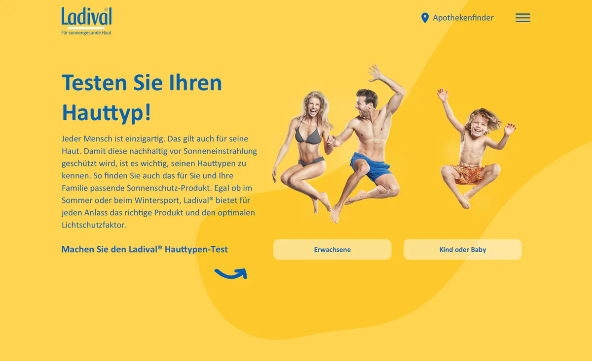
- The start separates adults from child or baby.
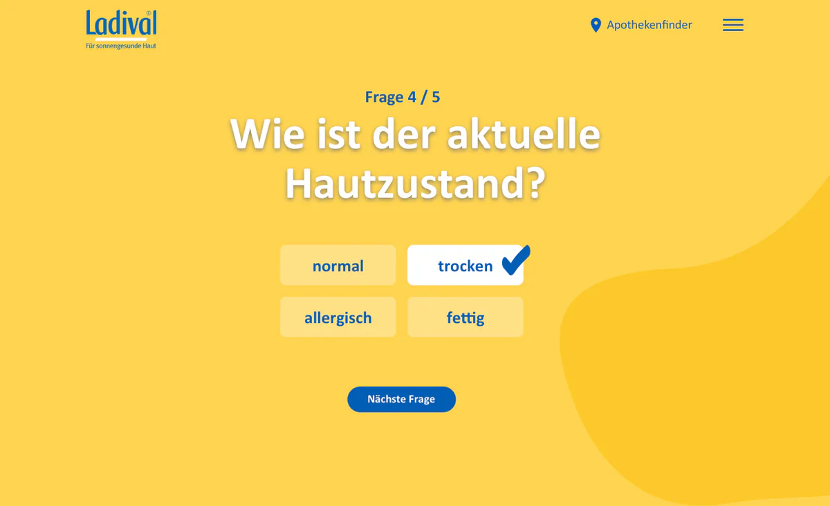
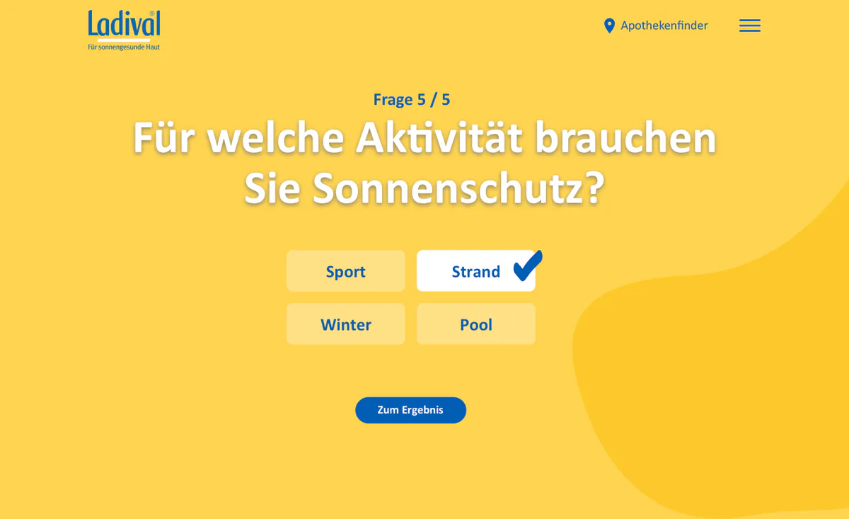
- Then the questions follow, for example about sensitivity, skin tone, skin condition and activity.
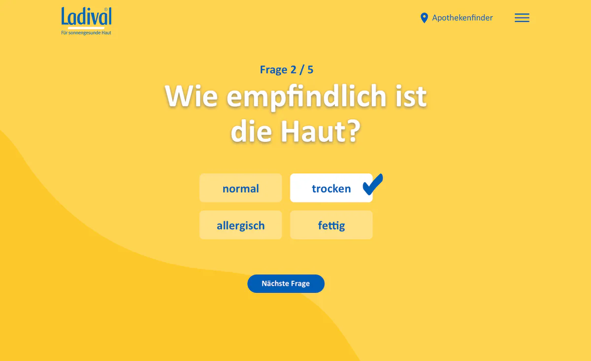
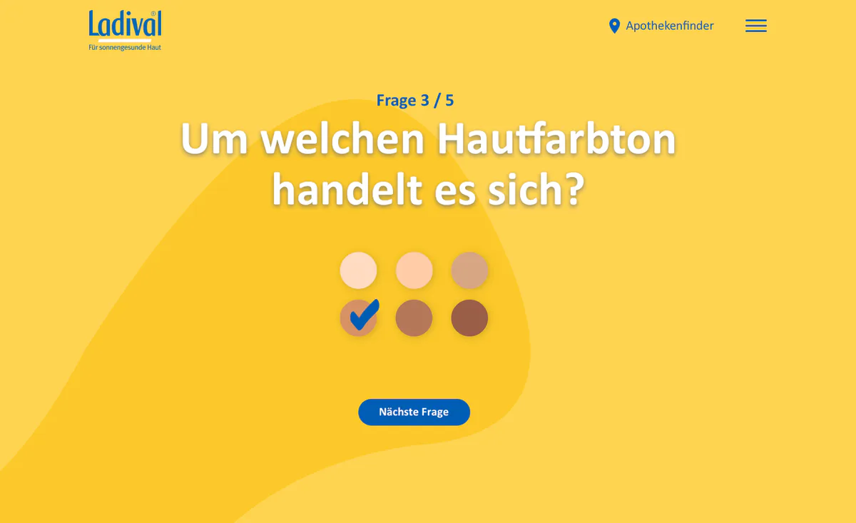
- Each question shows how far users have come, for example Question 3 / 5.
One question per screen
- Why: One question is quick to answer. The display Question x / 5 shows how much still follows.
- Instead of: One long questionnaire on one page.
- Trade-off: Each question needs its own click on Next question. In return, each screen shows only one question.
Tiles instead of input fields
- Why: Users tap a tile, and a check mark shows the choice. For skin tone, six round color fields replace text.
- Instead of: Selection lists and free text.
- Trade-off: Users can choose only given answers. In return, nobody has to type anything.
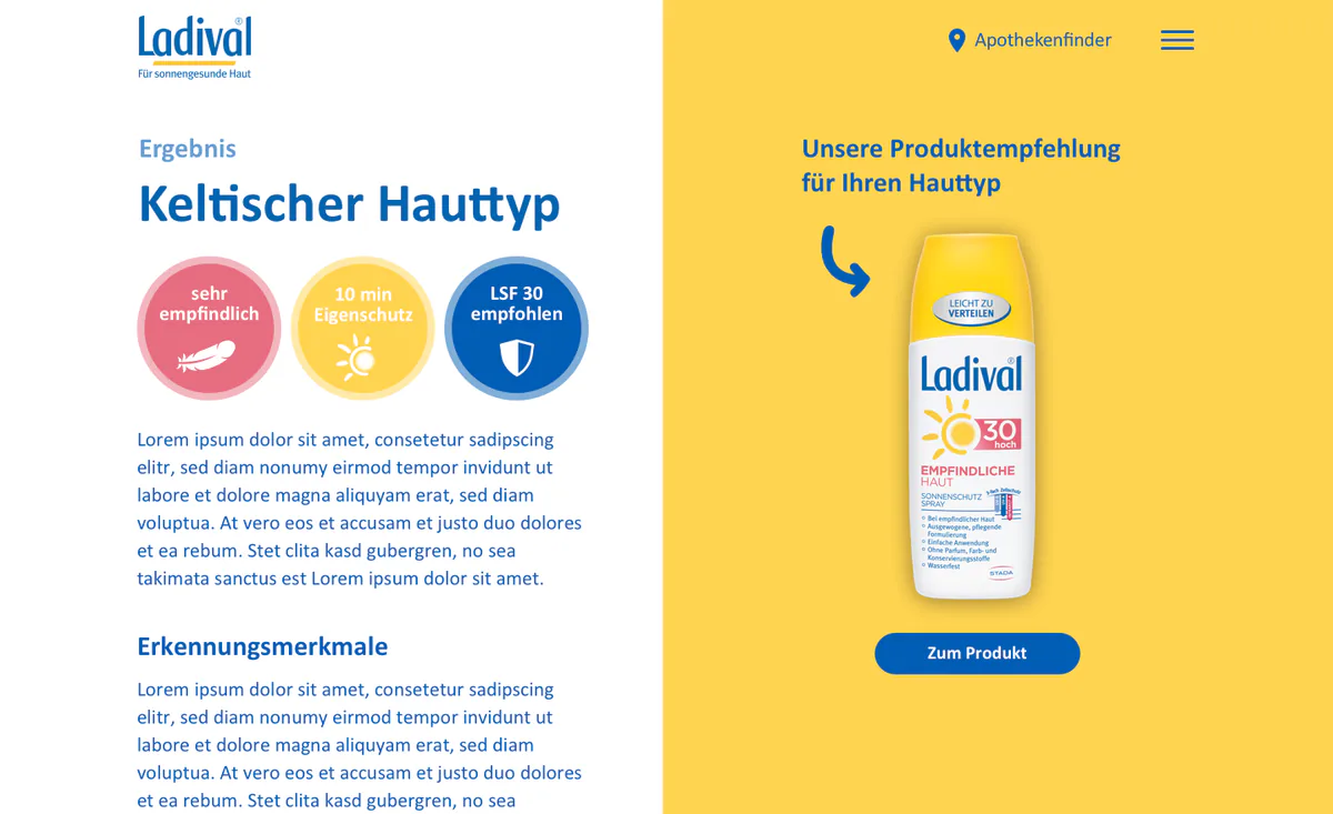
Result with next step
- The result names the skin type and shows three round key facts with a text.
- On the right is a recommended product with the button To the product.
- Why: After the test, users immediately see a product and a button for it.
- Instead of: Two products as in the flowchart.
- Trade-off: One recommendation leaves less choice. In return, the next step is clear.
Design
Home page
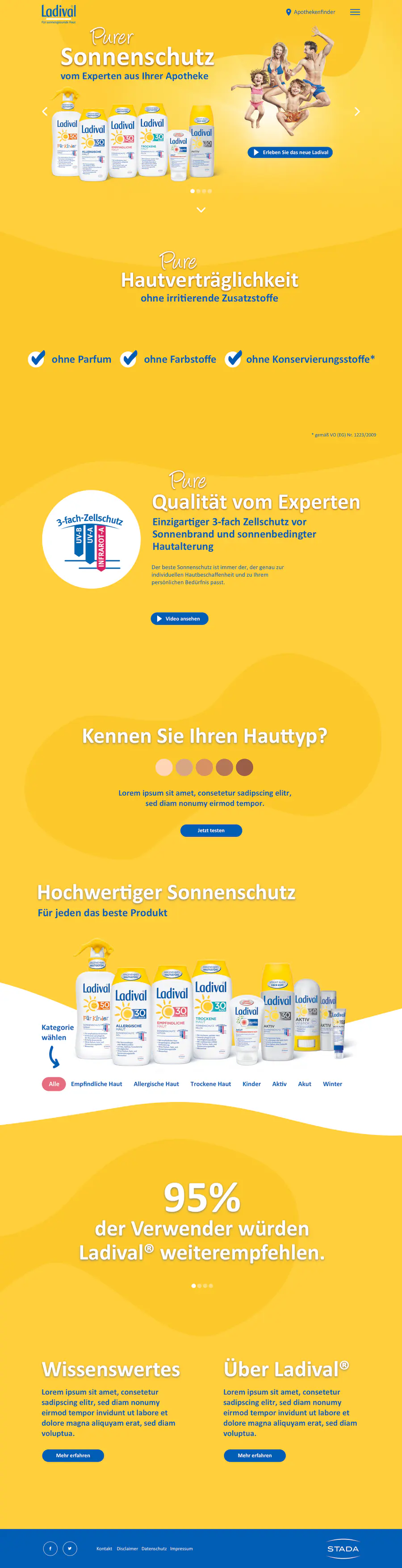
- At the top, the home page shows the title Pure sun protection and a row of products.
- In the middle is the start of the skin type test with round skin tones and the button Test now.
- Below follows the product selection with tabs.
Yellow and blue of the brand
- Why: Yellow areas carry the brand. Blue stands for buttons, headings and the footer.
- Pink appears only in small accents, for example at SPF 30.
- Instead of: Pink also for buttons and areas.
- Trade-off: The product lines differ less by color. In return, all buttons look the same.
Product page with a path to the test
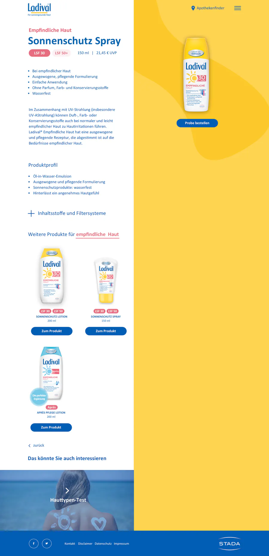
- The product page shows description, product profile and further products.
- On the right is the bottle with the button Order a sample.
- At the end, under You might also be interested in, follows the teaser Skin type test.
- Why: Whoever looks at a product can find the test directly.
- Instead of: Offering the test only in the navigation.
- Trade-off: Whoever does not read to the end of the page does not see the teaser. In return, nobody has to search the navigation.
Skin type test: start, questions and result
The test leads from the start to the result in six screens. Swipe through the screens.
Design: home page and product page
The home page and the product page stand side by side as approved designs in full length. Both lead to the skin type test.
Home page
Product page