
PTA Channel
Overview
The PTA Channel is an information and e-learning portal with an app for the pharmacy team. PTA learn what is new in short videos. They also understand brands and products better. At WEFRA, I developed the concept and the UI/UX design for the website and the app. The motto is: Let me edutain you!
- Type
- Web and app
- Role
- UI/UX design and concept
- Tools
- Figma
- Skills
- Interviews, UX concept, UI design, Prototyping, Usability tests
Project snapshot
Results
18
interviews with pharmacists and PTA
78 %
of the started learning units are completed
87 %
of the PTA feel better informed
Goal
The pharmacy team must learn quickly what is new. This includes new guidelines and new medicines. PTA must also understand the history of a brand. Knowing it helps them recommend products better.
Challenge
Pharmacy staff have little time to learn. The team must take in new knowledge between two customer conversations. The content must inform and also fit the brands.
Outcome
The team learns in units of three to five minutes. Points, certificates, and a clear dashboard motivate users to continue. Manufacturers can present brands and products in the channel.

UX research and discovery
- 18
Interviews
with pharmacists and PTA
- 3
rounds of usability tests
with PTA from pharmacies
- 4
competitors analyzed
learning offers for pharmacy teams
- 2
target groups
PTA and pharmacy managers
User goal
PTA want to be up to date quickly and reliably.
Business goal
PTA become brand ambassadors. Manufacturers present their brand messages in the channel.
User insights
72%
Informed too late
Many learned about new guidelines and medicines only late. This led to the idea of the PTA Channel.
81%
Wish for short units
Three to five minutes fit into the working day.
64%
Wish for certificates and points
Proof makes the effort of further training visible.
76%
Little time to learn
New knowledge arrives between two customer conversations. Long training sessions do not fit into daily work.
Color palette
- #253984Navy blue
- #172c81Dark blue
- #f38000Orange
- #ffb800Yellow
- #eaebf1Light gray-blue
Iterative process
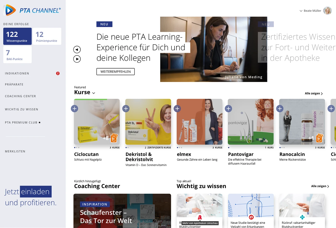
Desktop dashboard with points, menu, and new content
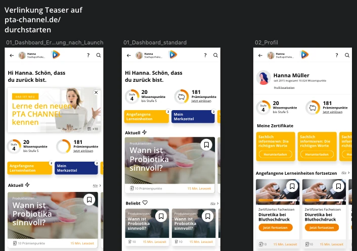
App: dashboard and profile
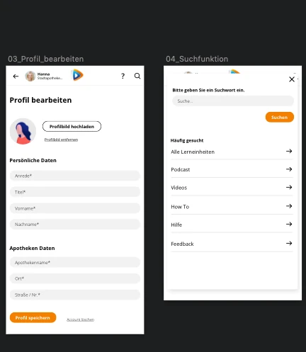
App: edit profile and search
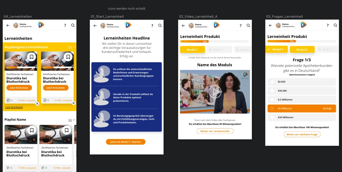
Learning unit: from the start to the questions
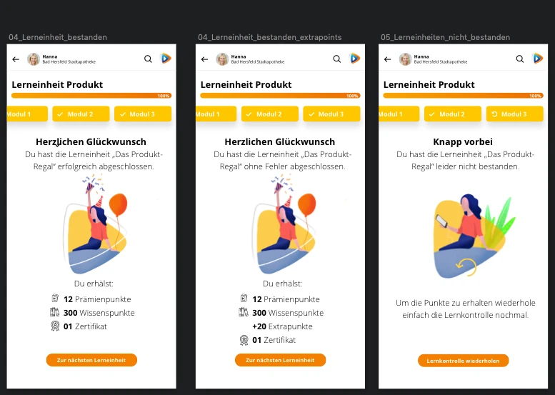
Learning unit: result with points and certificate
Concept
Persona Hanna, PTA
- Invented example persona.
- She often learns about new guidelines and medicines too late.
- Long training sessions do not fit into her working day.
- She does not know which further training counts for her.
Persona Sabine, pharmacy manager
- Invented example persona.
- She wants to keep her team up to date.
- She has no overview of who completed which further training.
- External training sessions cost time and money.
Desktop dashboard
- I designed the dashboard for the desktop first.
- The left column shows the points and the menu.
- The main area shows new courses and the Coaching Center.
Short videos instead of long training
- Why: A unit takes three to five minutes. This way, PTA learn between two customer conversations.
- Instead: Long training days outside the pharmacy.
- Trade-off: A unit explains only a few points. Deeper knowledge needs several units.
Points and certificates as an incentive
- Why: Knowledge points, reward points, and BAK points show immediately what a completion brings.
- Instead: Teaching knowledge without feedback.
- Trade-off: Points must not cover the content. Therefore, they stay small and clear in the dashboard.
App
Dashboard and profile
- The app greets Hanna and shows her points first.
- Started learning units and the notepad appear as tiles below.
- The profile collects points and certificates.
Profile and search
- The form separates personal data and pharmacy data.
- The search lists common destinations such as learning units, podcast, and videos.
Dashboard shows progress first
- Why: At the start, PTA see their points, the started units, and new content.
- Instead: A start page with large advertising areas.
- Trade-off: New campaigns get less space on the start page.
Learning units
From the start to the questions
- A unit starts with three key points.
- Then the video plays. A bar shows the progress.
- Modules and questions follow in small steps.
Result
- Users who pass see the points they received and the certificate.
- Users who pass without errors receive extra points.
- Users who do not pass repeat the learning check.
Second chance after a failed unit
- Why: Users who do not pass read a friendly message and repeat the learning check.
- Instead: A harsh error message.
- Trade-off: Repeating the check extends the learning time.
Validation
I tested the drafts with PTA in several test rounds. After each round, I revised the navigation and the flow of the learning units.
Reflection
Short units work when the start is clear. Points motivate as long as they do not push out the content. In the future, I would test progress and points with real users even earlier.