
Parqet
Overview
Parqet is an app that investors use to track their portfolio. I redesigned the Parqet mobile app completely. Features that existed only on the web are now in the app. For this, I analyzed competitors, surveyed users, and ran usability tests. New features include the daily overview, a dividend calendar for the smartphone, and the yearly Wrapped. I also designed shirts for the trade fair appearance and intros for the Friday Fireside.
- Type
- Mobile app and brand
- Role
- UI/UX design and concept, brand and motion design
- Tools
- Figma
- Skills
- Competitor analysis, User survey, UX concept, UI design, Prototyping, Usability tests, Motion design
Project snapshot
Results
58 %
of weekly active users open the daily overview
41 %
of active users open their Wrapped in the first two weeks
4.7 out of 5
satisfaction of the test users in the last round
Goal
The mobile app must offer the features that users know from the web app. Users must find their way quickly on the move. The brand must also look consistent outside the app.
Challenge
The web app has many features and many tables. The smartphone has little space for them. I had to decide what comes into the app first. Existing users must still find their way despite the new interface.
Outcome
A tab bar leads to the main areas. The home screen shows the portfolio and the daily overview. The dividend calendar shows dates as a month grid. The Wrapped tells the year as a story with motion.

UX research and discovery
- 18
Interviews
with users of the Parqet app
- 412
Survey responses
on the importance and priority of the features
- 3
Rounds of usability tests
with six participants each on the prototype
- 6
Competitors analyzed
portfolio apps for the smartphone
User goal
Users want to see quickly, on the move, what has changed in their portfolio. They want to use the same features in the app as on the web.
Business goal
The app covers the most important features of the web app. More users open it every week. The brand looks consistent in the app, in Wrapped, and at trade fairs.
User insights
78%
Wish for a quick overview
They usually look into the app only briefly, for example on the move.
69%
Dividend calendar on the smartphone
They want to see there too when each dividend is due.
64%
Web features missing in the app
Analyses and reports were missing most often.
72%
Short review instead of a long report
They find a compact yearly review better than many charts.
Color palette
- #009991Parqet turquoise
- #334155Slate
- #0c0c0cNight black
- #625184Violet
- #f3f5f7Light gray
Iterative process
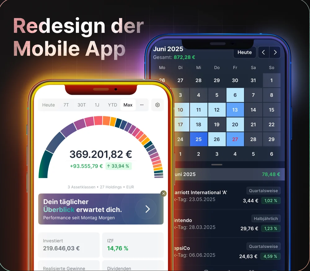
Redesign of the mobile app: home and dividend calendar
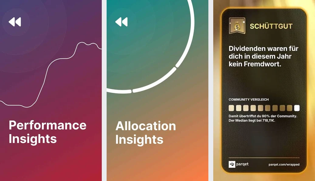
Parqet Wrapped: slides of the story
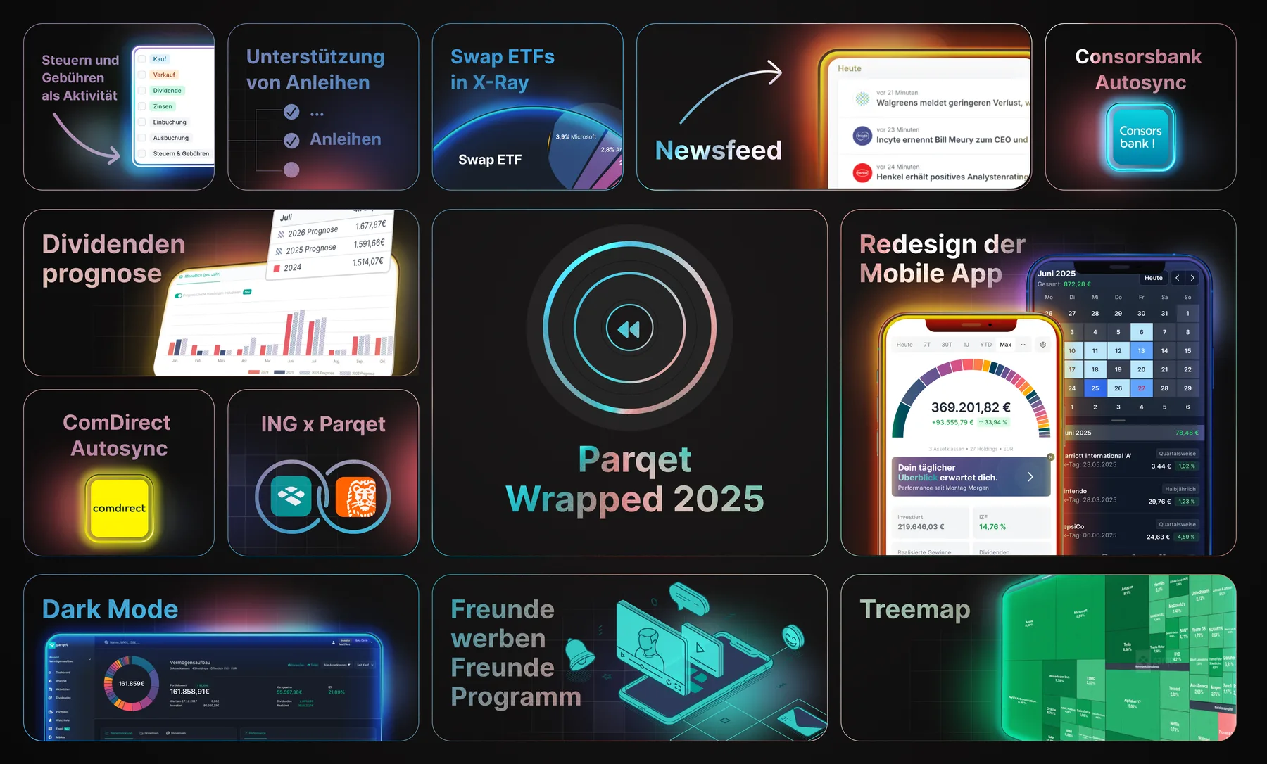
Parqet Wrapped 2025: announcement of the new features
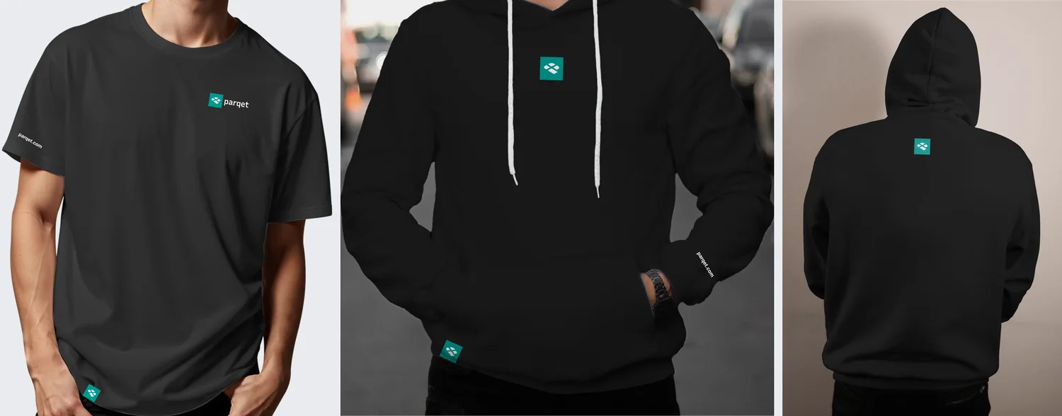
Shirts and hoodies for the trade fair appearance
Research
Persona Mara, occasional user
- Invented example persona.
- She usually looks into the app briefly, for example on the way to work.
- She wants to see at a glance what has changed.
- Long tables on the smartphone put her off.
Persona Tim, dividend fan
- Invented example persona.
- He knows the web app well and uses many reports there.
- He misses these reports in the app.
- He wants to check dividend dates on the smartphone too.
Competitor analysis
- I compared six portfolio apps for the smartphone.
- I looked at navigation, start page, and range of features.
- The result was a list of gaps and opportunities for Parqet.
Survey and priorities
- I asked users in interviews and in a survey.
- They sorted features by importance.
- This produced a ranking for the app.
Prioritized features instead of a 1:1 copy
- Why: On the move, users do not need every web feature equally urgently. The ranking sets the order.
- Instead of: Copying all web features one to one into the app.
- Trade-off: Some features come later. In return, the most important ones are easy to use first.
App redesign
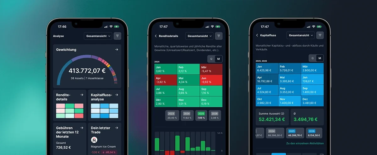
New structure of the app
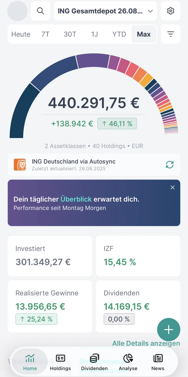
- A bottom tab bar leads to Home, Holdings, Dividends, Analysis, and News.
- The home screen shows the period and the portfolio at the top.
- Key figures are below as tiles.
Daily overview as a banner on the home screen
- Why: A short summary saves the way through many areas. The banner Your daily overview awaits you points to it.
- Instead of: A full-screen dialog when the app starts.
- Trade-off: Not every user sees the daily overview. In return, nobody must dismiss it. Users can close the banner.
Dividend calendar as a month grid
- Why: A month grid shows the dates at a glance. Users who tap a day see the payments below.
- Instead of: The wide table of the web app.
- Trade-off: The grid shows fewer columns. Details appear only after a tap on a day.
Analysis in tiles
- Why: Each tile leads to a report and already shows a preview.
- Instead of: One long page with all reports.
- Trade-off: It takes one more step to reach the report. In return, the overview stays calm.
Features from the web in the app
- The ranking sets which web features come into the app.
- These include analyses and reports.
- Each feature gets a layout for the thumb and for small screens.
Wrapped and brand
Parqet Wrapped 2025
- The Wrapped is a yearly review of the portfolio, similar to Spotify.
- It runs as a story with slides, progress bars, and a share function.
- Each slide carries one message and has its own color world.
- Motion leads from slide to slide.
Story instead of a report page
- Why: A story leads through the year in short steps. Users swipe on and do not need to search.
- Instead of: One long page with charts.
- Trade-off: The slides show fewer numbers. Users who want to know more open the analysis.
Motion with purpose
- Why: Motion draws the eye to the key message. Lines draw themselves and numbers count up.
- Instead of: Motion as pure decoration.
- Trade-off: Design and implementation take more time. Each animation needs a clear purpose.
Shirts for the trade fair appearance
- I designed shirts for the trade fair appearance.
- The logo sits small on the chest.
- The text parqet.com is on the sleeve.
- The designs also exist as a hoodie.
Small logo instead of a big print
- Why: A small logo looks calm and is easy to wear every day.
- Instead of: A big motif on the chest.
- Trade-off: The shirt stands out less from a distance. In return, it also suits occasions outside the trade fair.
Intros for the Friday Fireside
- The Friday Fireside is a weekly streaming format.
- It reports news about the tool and the company.
- I designed the intros with motion and the color world of the brand.
Weekly dividend post
- Once a week, an automated post about dividends appears.
- The post only informs about upcoming dividend payments.
- The team built a system that creates the images itself and publishes them at a fixed time.
- The system saves about two hours of manual work per week.
- On average, the posts get about 25% more interactions than earlier posts made by hand.
Template instead of manual work
- Why: A fixed template makes each post recognizable. The system fills it with new data every week.
- Instead of: New graphics by hand every week.
- Trade-off: The template leaves little room. New motifs need an adjustment of the template.
App screens
Home 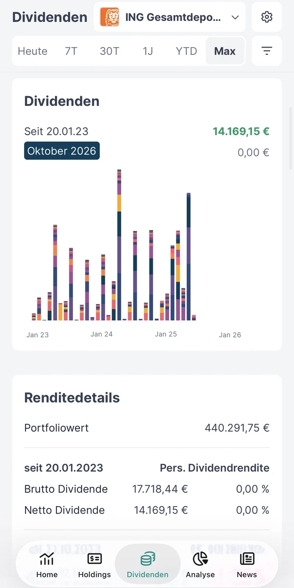
Dividends 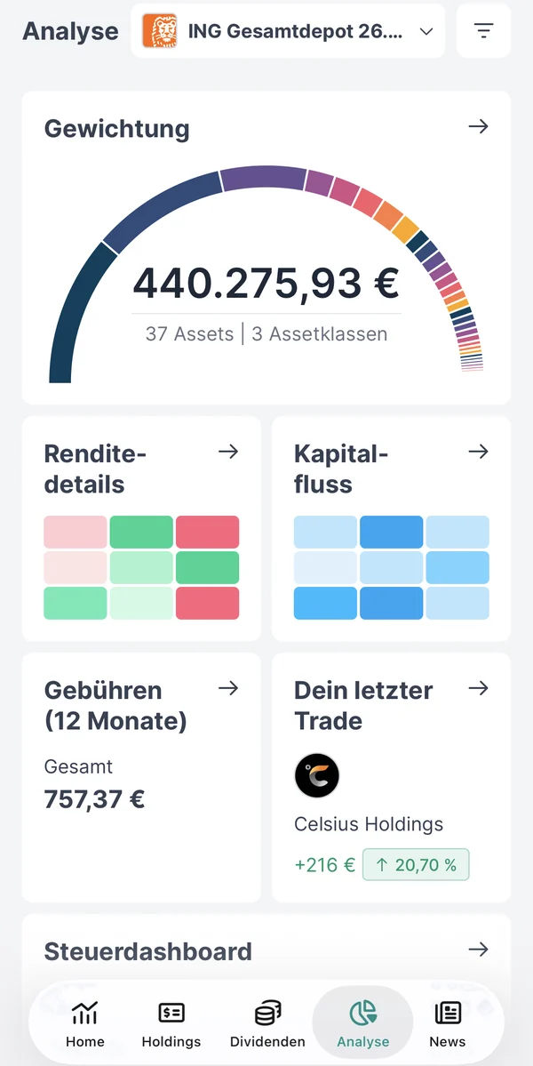
Analysis 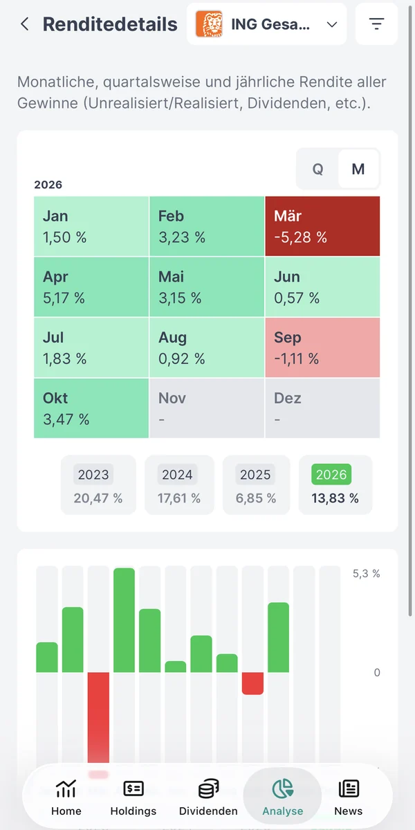
Return details 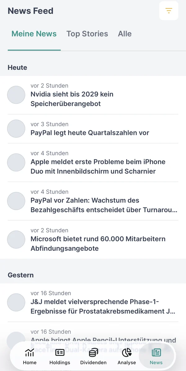
News
Validation
I checked the designs in three test rounds with users of the app. Each round had six participants. After each round, I revised navigation, dividend calendar, and daily overview. The team tested the Wrapped internally before the launch.
Reflection
The ranking by user wish ended the discussion about the scope. The banner made the daily overview known without disturbing users. In the Wrapped, motion needs calm so that users can read each slide. In future, I would involve users even earlier in the Wrapped designs.