
mein.techem Customer Portal
Overview
mein.techem is the customer portal of Techem. Property managements and landlords create heating and utility cost statements there. Tenants see their consumption online. In the Techem team, I developed the concept and the UI/UX design for the two main applications. These are Abrechnung Direct and the EED Verbrauchsinfo. The content contains no confidential data.
- Type
- Web portal
- Role
- UI/UX design and concept
- Tools
- Figma
- Skills
- Interviews, UX concept, UI design, Prototyping, Usability tests
Project snapshot
Results
under 30 min.
to a finished statement, before several hours
86 %
of the statements are created without a call to the service
4.6 of 5
satisfaction of the test users
Goal
Property managements create a heating and utility cost statement in a few clicks. They are sure that the statement is correct. Tenants understand and compare their consumption online.
Challenge
A statement has many cost types and allocation keys. Users who rarely create one quickly fear errors. The application must guide users without patronizing them. Techem specialists must also be able to use it.
Outcome
A stepper leads to the finished statement in four steps. Values from the last period are already entered. Help, notes, and a Smart Check are directly in the application. The EED Verbrauchsinfo shows tenants their consumption every month.

UX research and discovery
- 14
Interviews
with property managements, landlords, and Techem service employees
- 4
Rounds of usability tests
with property managements on the prototype
- 3
Competitors analyzed
Statement portals and consumption portals
- 3
Target groups
Property managements, private landlords, and tenants
User goal
Property managements want to create a correct statement quickly and without follow-up questions. Tenants want to understand their consumption.
Business goal
More statements are created online and without help from the service. The EED obligation to provide consumption information is met in an understandable way.
User insights
71%
Fear of errors
Many feared entering something wrong in the statement.
83%
Wish for carried-over values
The cost types and allocation keys of the last period are already filled in.
67%
Help right at the spot
Users who got stuck used to call the service.
74%
Tenants want the comparison
They want to see their consumption compared with the last period and with other households.
Color palette
- #e20714Techem red
- #212529Anthracite
- #007c8fPetrol
- #f8f9faLight gray
- #ffffffWhite
Iterative process
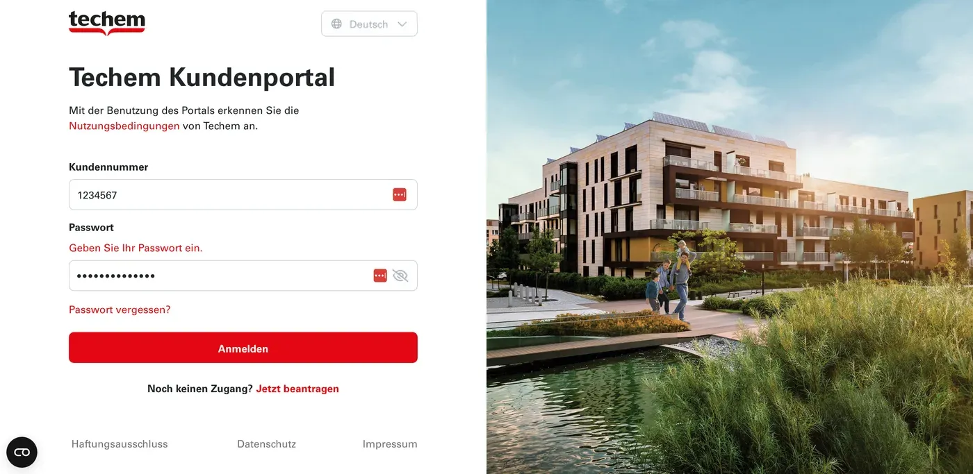
Login to the Techem customer portal
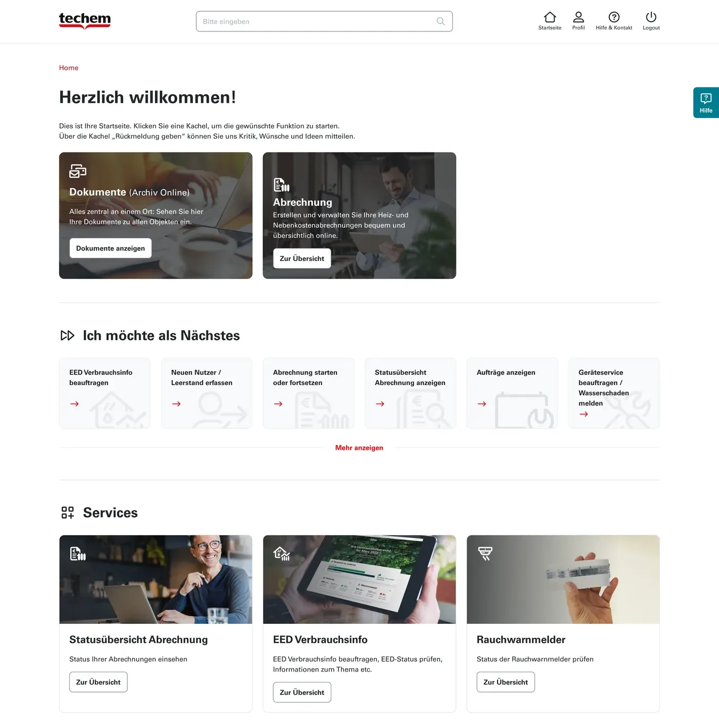
Start page with shortcuts and services
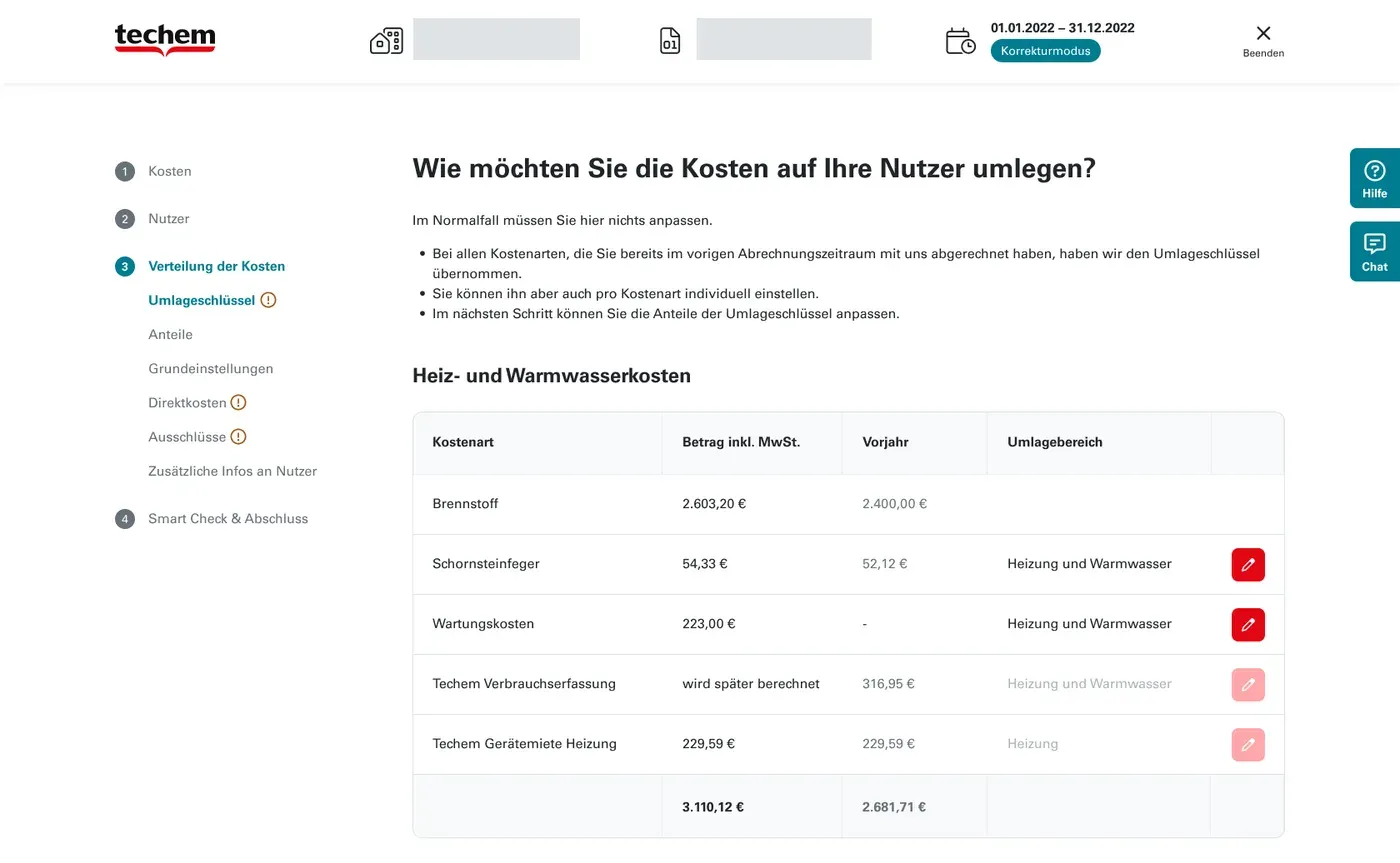
Abrechnung Direct: Stepper and allocation keys
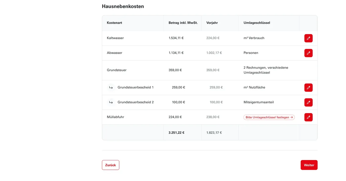
Abrechnung Direct: Building operating costs and note
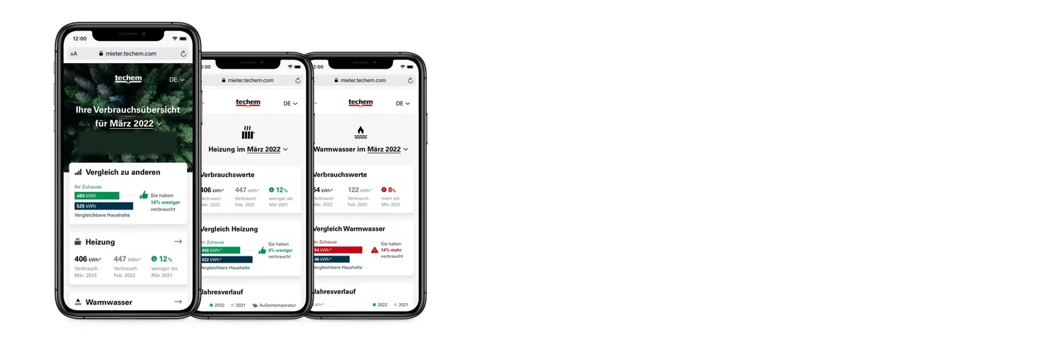
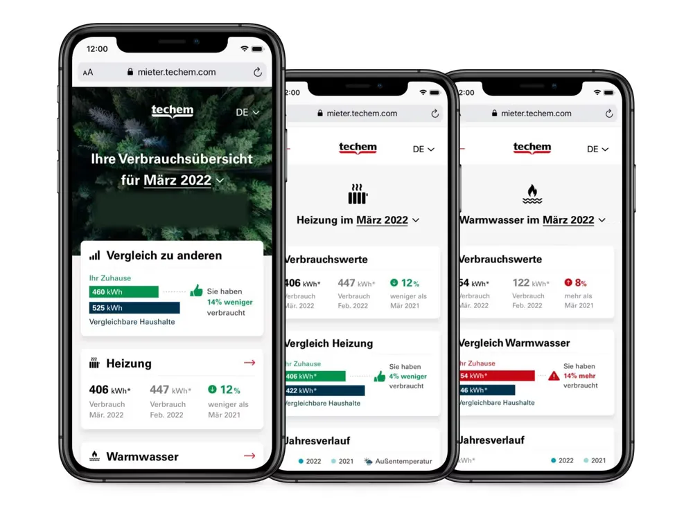
EED Verbrauchsinfo on the smartphone
Concept
Persona Ms. K., property manager
- Invented example persona.
- She looks after many properties and creates the statements on the side.
- She avoids errors because tenants ask questions.
- She wants to know what stays the same and what is new.
Persona Mr. S., service employee at Techem
- Invented example persona.
- He answers questions about allocation keys every day.
- He wants to help customers directly in the application.
- He quickly sees where a customer gets stuck.
Start page of the portal
- Large tiles lead to documents and to the statement.
- The row I want to do next offers shortcuts.
- Services and properties follow below.
Shortcuts for frequent tasks
- Why: Property managements mostly start the same tasks. These include the statement and the status overview.
- Instead: A menu with many levels.
- Trade-off: Rarely used features are behind Show more.
Abrechnung Direct
New application for the statement
- We rebuilt the application completely.
- Property managements create a statement in it in a few clicks.
- It guides through costs, users, cost allocation, and Smart Check.
Cost allocation
- The table shows the amount and the previous year side by side.
- A red pencil opens a single cost type.
- A note marks where an allocation key is still missing.
Stepper instead of a long form
- Why: Four steps divide the work into manageable parts. The stepper shows where the users are.
- Instead: A long form with all fields.
- Trade-off: Users jump freely through the application less often. In return, they keep the overview.
Values from the last period prefilled
- Why: The cost types and allocation keys are already there. Usually nobody has to change anything.
- Instead: Empty fields that start again every year.
- Trade-off: Users who do not check the prefilled values carry over old errors. Therefore, the previous year is shown next to them.
Help and notes in the application
- Why: Help and chat are at the edge. Notes and warnings appear at the affected place.
- Instead: A separate manual.
- Trade-off: The page shows more text. Therefore, the notes stay short.
Smart Check before completion
- Why: The Smart Check checks the statement before submission and names open points.
- Instead: Report errors only after submission.
- Trade-off: One more step takes time. It saves follow-up questions afterwards.
Correction mode for finished statements
- Why: A chip in the header shows the correction mode. Users change values without starting again.
- Instead: A new statement for every change.
- Trade-off: The mode needs a clear label. Otherwise, users confuse it with a new statement.
EED Verbrauchsinfo
Persona Mr. M., tenant
- Invented example persona.
- He prefers to read his consumption on the tablet.
- He wants to know whether he uses more or less than before.
- Numbers alone tell him little.
Monthly consumption overview
- The EED requires consumption information for tenants.
- Tenants see heating and hot water separately.
- Arrows and colors show more or less consumption.
Ordering in the portal
- Property managements order the EED Verbrauchsinfo through a shortcut.
- The status overview shows which properties are already running.
Comparison instead of a bare number
- Why: The comparison with the last period and with other households makes the consumption tangible.
- Instead: A table of measured values.
- Trade-off: The comparison simplifies. A note explains where the values come from.
Validation
I tested the drafts in four test rounds with property managements. Techem service employees read the help texts and notes. After each round, I revised the stepper and the notes.
Reflection
Prefilled values and help at the right place reduce the fear of errors. The correction mode must be clearly visible. In future, I would involve the service specialists in the drafts even earlier.